Creator Manual
This document is work in progress.
To propose specific content, feel free to contact as via mail (o2a-support@awi.de) or create a Gitlab issue.
Data
Import
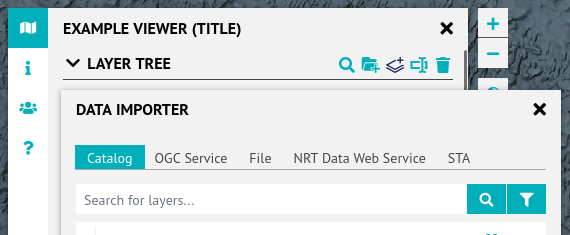
Use the data importer, that can be accessed using the "add layer" button in the layer tree tools.
As a reminder, let's quote the viewer overview page:
It is important to know that viewers generally do not contain or store data but embed map services that provide data or data visualisations on-demand. Viewers can embed map services hosted anywhere on the internet as long as those are publicly accessible.
While this is true, there are some exceptions. Besides a catalog of existing map services the data importer supports a bunch of data source types, some of which are local files. For details, see the Files subsection.
For the recommended approach, see the WMS/WFS subsection.
Files
The File tab allows for TSV, CSV, GeoJSON and PANGAEA tab files to be added either via URL or locally from a filesystem.
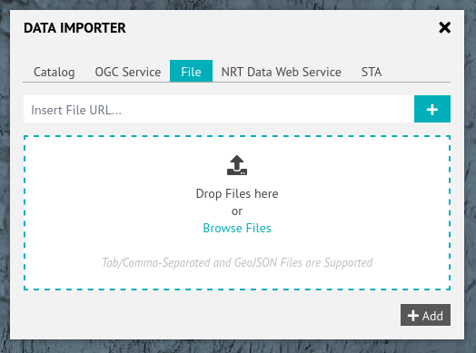
This feature is proof-of-concept. It also generally does not store the data within the viewer longer than your browser session (with GeoJSON being an exception) and thus is not suitable for sharing data with others.
In almost all cases the use of OGC services, especially map services (WMS), is encouraged.
WMS, WFS
To add WMS or WFS layers, either use the Catalog tab or the OGC Service tab.
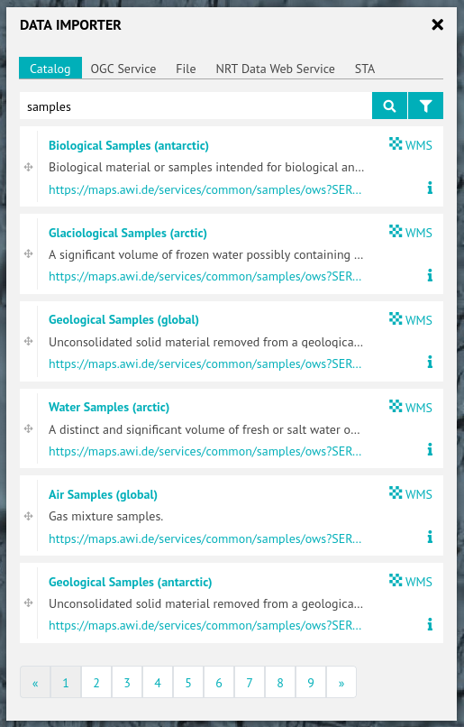
Catalog
The catalog contains hundreds of WMS layers hosted at AWI, partner institutions and public authorities. Using the filter/funnel button, WFS layers can be included.
To decide which layer you want, use the information button (i) to consult layer metadata.
To add a layer to the layer tree left-click its title, placing it on top of the layer tree, or use drag&drop to directly place it at a specific position within the layer tree.
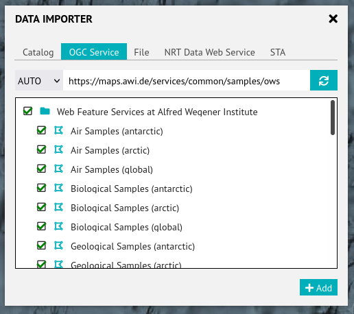
OGC Service
With this tab, WMS and WFS can be queried for layers to be added.
The selected layers (by default: all of them -- be careful) will be added to the top of the layer tree, contained in one folder per service.
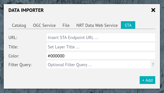
STA
This tab supports querying SensorThings API (thus STA) endpoints which is an OGC standard for streaming sensor data.
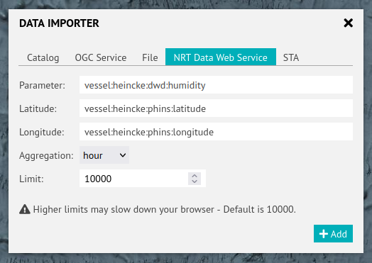
NRT
This tab supports querying near-real-time data from the O2A pipeline.
Styling: Map
Baselayer
To choose a specific baselayer (some coming in different looks) use the baselayer switch.
Layers
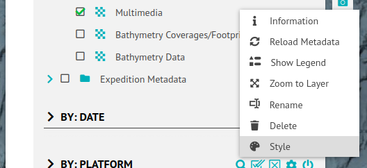
To change the appearance of specific layers, select Style in their context menus. A layer's context menu can be opened via right click on its title or a left click on the downward-facing triangle next to the layer title.
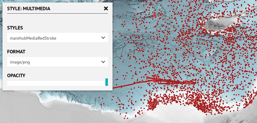
The resulting popup offers a bunch of options, some of them depending on the layer's metadata and/or internal configurations. Available for each and every layer is the opacity setting. It controls the opaqueness (opposite of transparency) the layer gets rendered with.
Service-based layers additionally offers to choose
- the file format they are requested in which might affect their ability to have server-side transparency. The default usually is PNG and should not be changed unless you know what you're doing.
- a style from a dropdown menu, populated with styles from the layer's metadata.
File-based layers do not offer any styling possibility right now.
Styling: Popup/Sidebar
When interacting with map content, popups and the right sidebar show metadata of the selected features of the map. To change the appearance of popups and sidebars, checkout the according documentation.
This is possible both for AWI-hosted layers but also those part of externally hosted map services.
Filters
Filter widgets (UI elements in the left sidebar) apply filters to layers selected in the Layer Tree and impact their content shown on the map. There are different types of filters (temporal, spatial, attribute) and different types of filter widgets available:
| Filter Type | Filter Widget Type | Default Widget Title |
|---|---|---|
| Attribute | Checkbox | CHECKBOX FILTER |
| Attribute | Dropdown | DROPDOWN FILTER |
| Attribute | Key-Value | FILTER BY ATTRIBUTE |
| Attribute | Range | FILTER BY RANGE |
| Temporal | Temporal | TEMPORAL FILTER |
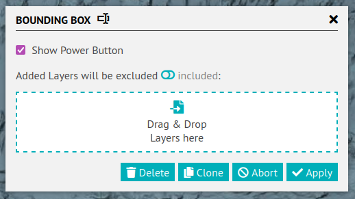
| Spatial | Bounding Box | BOUNDING BOX |
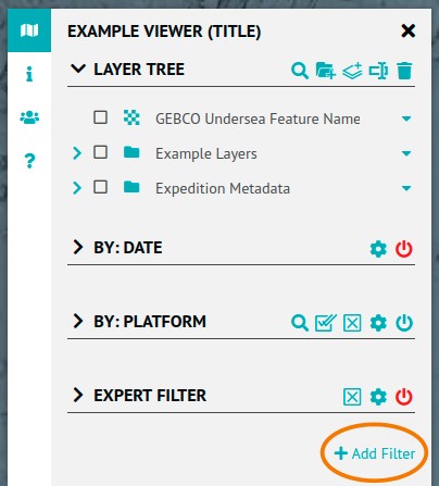
In the left sidebar, below the Layer Tree and all prior added filter widgets, is an + Add Filter button. Use this to add new filter widgets. Once filter widgets have been added, they will be listed below the layer tree. It is possible to add more than one filter widget of each type.
Filter widgets can and should be configured and renamed (like in the screenshot below) to suit to your needs.
Data displayed in a viewer is generally either homogeneous or heterogeneous raster and/or feature data. Homogeneous data means that all data layers is equal in terms of its parameters, file configurations and formats. In contrast, heterogeneous data comes from multiple sources and has different file and table configurations and formats.
Additionally, filters work differently on raster and feature data. It is not possible to filter the pixel values of individual raster files (or map services using raster data). However, time and other attributes associated with the raster file (rather than the individual pixel) can be filtered, as long as the used map service supports this.
Feature data, which is displayed as points, lines or polygons, generally comes with tables, and all table columns can be queried. The filter examines the data table and identifies the columns that can be queried using the given filter configuration. If a column can be filtered, a result will be shown. Otherwise, an exclamation mark will appear next to the layer. This indicates that the selected layer is configured differently and the filter is not applicable.
Configuration
All filter widgets have a "Filter Settings" tool, the gear icon. This opens a popup to configure the filter widget (which might result in more or less other widget tools). Some settings are available for all types (see screenshot and table) of filter widgets, some are specific.
| Setting | Description |
|---|---|
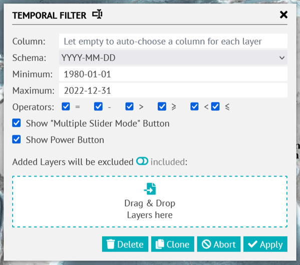
Show Power Button | Enables/disables the power button tool for the users. |
excluded/included | Allows to either create an exclude or include list of layers that should be affected by this filter widget. Use the exclude-include switch to toggle between these approaches and drag&drop layer from the Layer Tree to the area below. If empty (default), all layers will be affected by this filter widget, possibly resulting in the warning indicator next to layers not supporting the configured filter. |
The key-value filter widget and the bounding box filter widget do not offer any specific settings.
Range
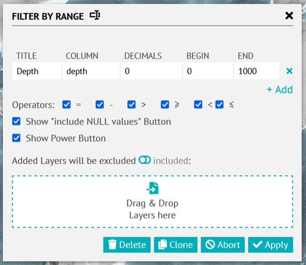
With the + Add button further rows (entries) can be added to the table, each representing a possible range to be chosen from by the user. Different entries can filter different columns.
| Entry Setting | Description |
|---|---|
TITLE | This line's label to be used in the filter widget's dropdown menu. |
COLUMN | Column to be filtered. |
DECIMALS | Numeric precision. |
BEGIN | Range minimum. |
END | Range maximum. |
| Setting | Description |
|---|---|
Operators | Which operators to be offered to users. |
Show "include NULL values" Button | Whether to offer users a filter widget tool (small N/A icon next to filter widget title) that toggles whether NULL values should be considered included or excluded. |
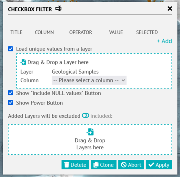
Checkbox
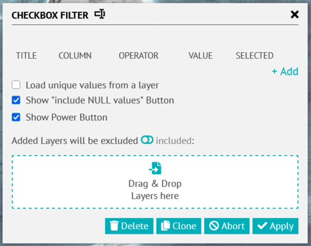
With the + Add button further rows (entries) can be added to the table, each representing a possible range to be chosen from by the user. Different entries can filter different columns.
| Entry Setting | Description |
|---|---|
TITLE | This entry's label to be used in the filter widget. |
COLUMN | Column to be filtered. |
OPERATOR | Operator to be used for filtering. |
VALUE | Value to be used for filtering |
SELECTED | Whether this entry should be selected by default. |
| Setting | Description |
|---|---|
Load unique values from a layer | Whether to load all possible values of one specific column of one specific layer to the filter widget as entries (adding to the manually defined entries). These will be dynamically loaded when the viewer loads. See below for details. |
Show "include NULL values" Button | Whether to offer users a filter widget tool (small icon next to filter title) that toggles whether NULL values are considered included or excluded |
Another window will open. By dragging and dropping the data layer onto this window, the names of all the columns in the selected data layer will be listed. Selecting one of these columns will display its values in the filter.
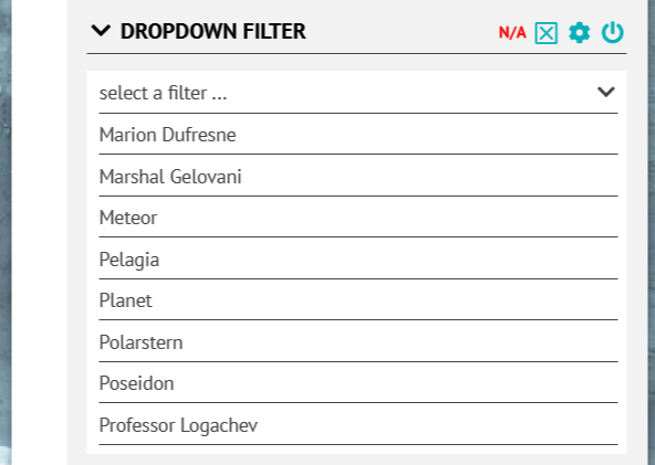
Dropdown
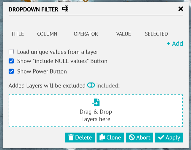
The Dropdown Filter is very similar to the Checkbox Filter and the way to configure it is the same, e.g. Load unique values from a layer.
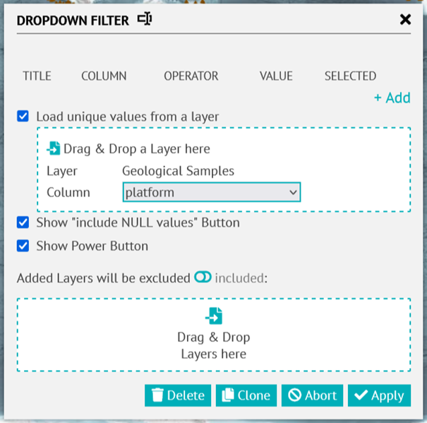
Just the way how the filter is going to be display is different but only up to one value can be selected at a time.
Temporal
| Setting | Description |
|---|---|
Column | Attribute name (column) to be used for time filtering. If given, all layers (respecting the exclude/include settings, see below) will be filtered using that attribute/column. If not given (default), an appropriate column will be automatically chosen for each layer. |
Schema | Filter Precision: YYYY-MM-DD, YYYY-MM, YYYY are possible. Time of day cannot be filtered. |
Minimum, Maximum | Minimum and Maximum of the time range that is allowed for filtering. |
Operators | Which operators to offer users to choose from. |
Show "Multiple Slider Mode" Button | Whether to offer users the multi-slider tool. |
Viewer Metadata
Beside the Layers Tree and the Help tab are two tabs on the left side bar that is configured to provide further information about the projects: Ther Information tab and the Contributor tab.
Information Tab
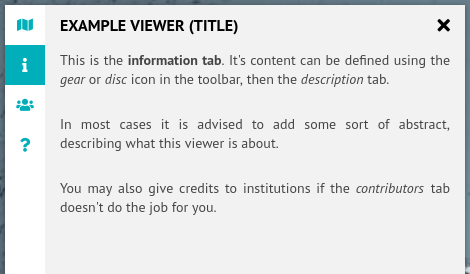
Provides further information or an abstract of the project/viewer, as well as information about how to cite it.
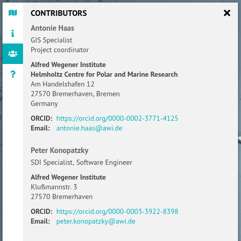
Contributors Tab
These tabs can be configured using the gear and save buttons:

The gear and save buttons only appear after the login. By selecting the gear button a new window with several tabs opens:
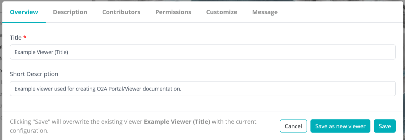
Overview
- Name: Name of viewer/project. It should be as short, specific and meaningful as possible.
- Short description: All viewers are listed as tiles in the portal, each with a link to the viewer and this short description.
- Save: Saves any added content or changes made to the viewer.
- Save as new viewer: Saves any added content or changes made to a new viewer.
- Cancel: The additional content or changes made will not be saved.
Description
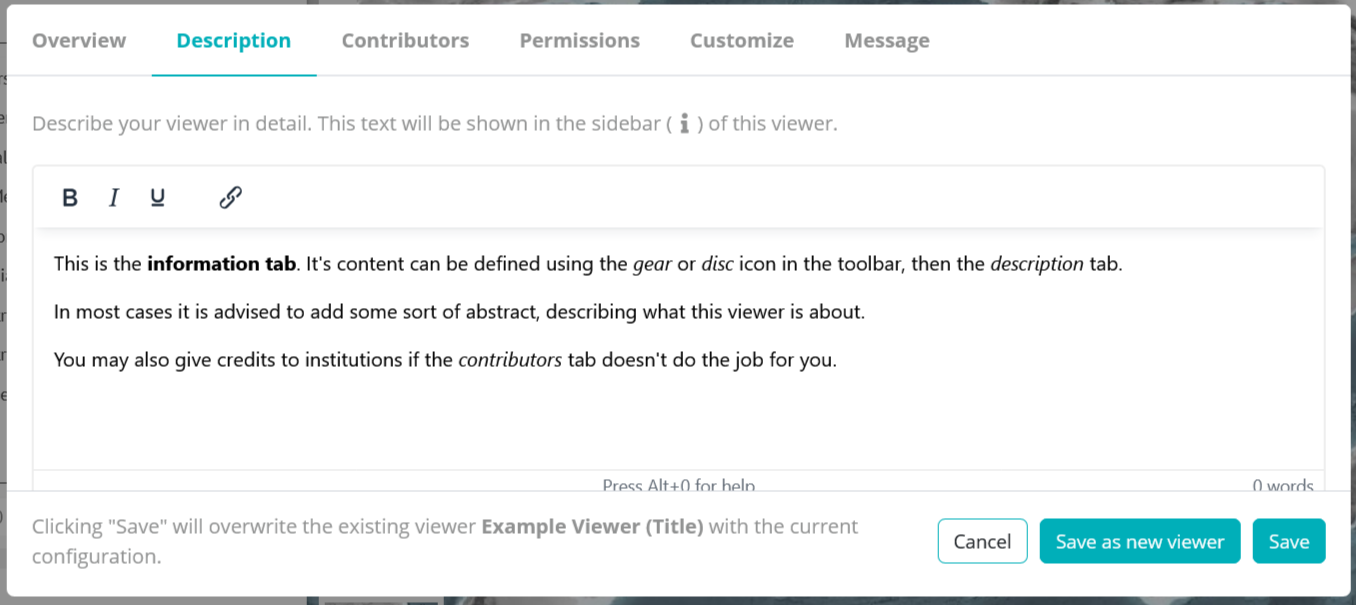
Add an abstract about the project and the data displayed in the viewer here. Citation information can be provided additionally.
Simple HTML is allowed.
Contributors
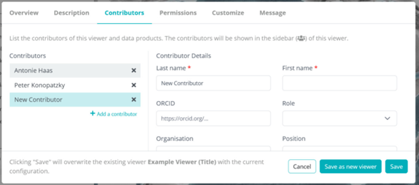
All contributors to the project/viewer can be listed individually by filling in the form. As always, the asterisk informs about which details are required.
Permissions
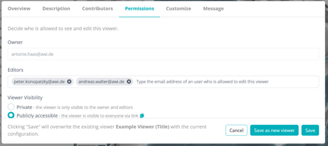
- Owner: The viewer creator's email address.
- Editors: Others listed by the owner can edit the viewer.
- Viewer Visibility
- Private: If selected, only the owner, editors and portal admins may access the viewer.
- Public: If selected, the viewer will be publicly accessible worldwide.
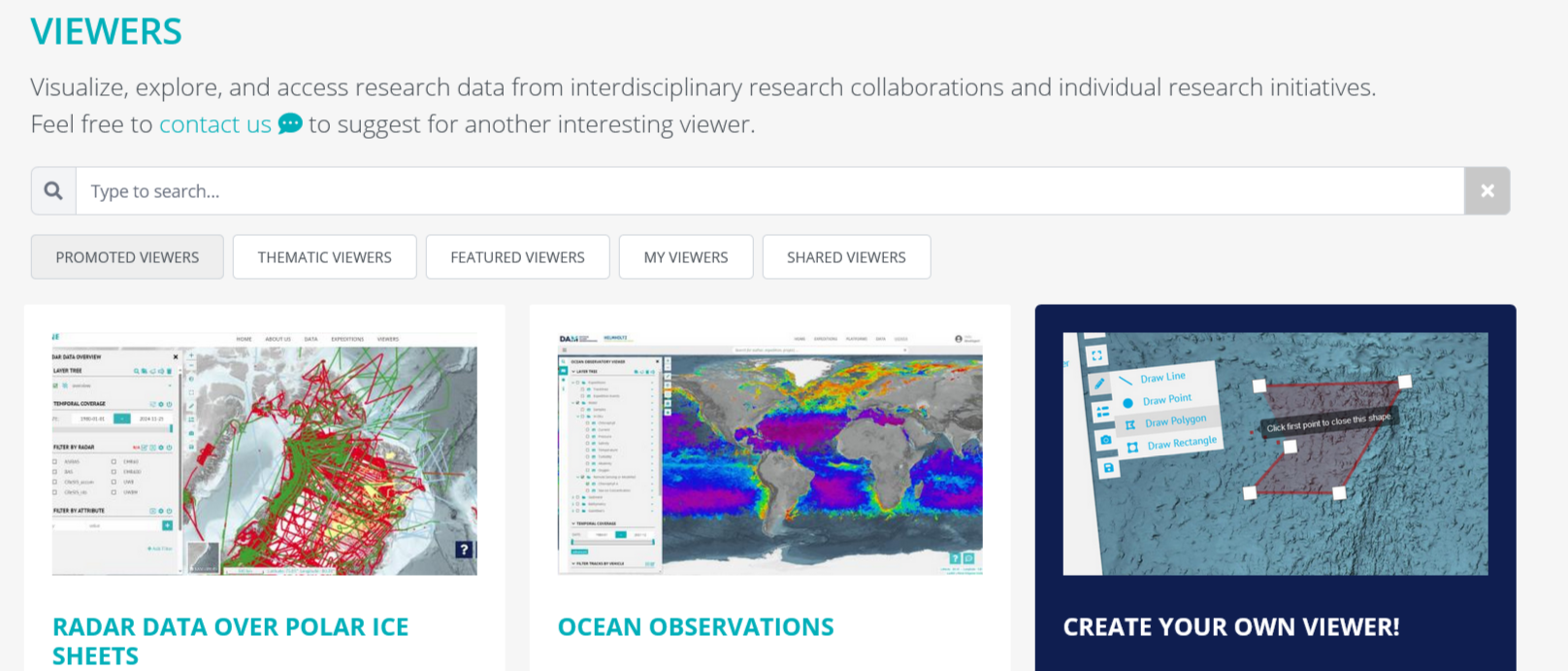
- Promoted: Option to add the viewer to the 'Promoted Viewers' list on the portal, making them easily accessible (see screenshot below)
- Viewer Best Practises will need to be followed.
Customize
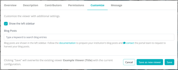
Show the left sidebar: If unselected, this will hide the left sidebar. No layer tree, filters, or metadata (description, contributors) will be accessible for users.
Message
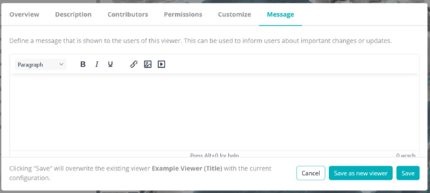
Keep users informed of any significant changes made to the viewer, such as the release of a new version, further functionalities or the addition of new data.